
CONTRIVED PICTURES
It’s early morning. I vacillate. Coffee or a glass of refreshing champagne? I have a sip of coffee, read cards, and then go over to the bubbles. Five minutes into my fortune telling I understand why I need the bubbles. I like to pay attention to what my ambivalence gives rise to, and since I can’t decide on the spot whether I want the one drink or the other, I’m curious to see where it leads to.
It leads to selecting gelatin silver prints to fit into some mats I made out of hefty vintage cold pressed paper. I was pleased with myself. Ta da, I have ‘archival’ mats now…
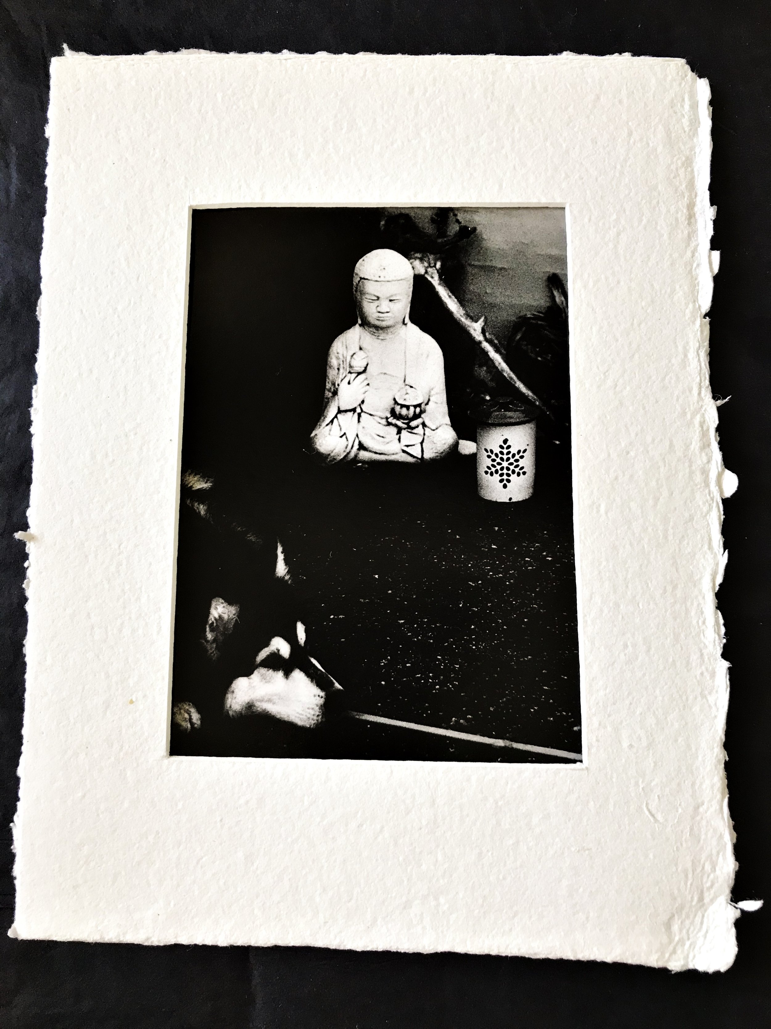
Silver gelatin print of my dog, Frigg, and the Buddha in the garden
The more I go through the pile of photographs, the more I think: ‘actually, perfect pictures enervate me. When is the sky ever perfect, fixed in its contrivance, colored or monochrome to an idea of perfection? The sky is sublime, and the sublime is anything but perfect.’
Whenever I entertain such thoughts, I think of my favorite masters. I have Yamamoto Masao at the very top of my list. There’s simply no other photographer that excites me as much as he does.
His photographs are anything but perfect. Some even refer to them as lacking technical standard. Shintaro Ajioka writes this much in the inset essay to Yamamoto’s own book, A Box of Ku. He states: ‘Yamamoto’s prints are, by standard measures, technically inferior. He breaks the rules and conventions of photography. He defaces and dyes his prints, which are not only small, but slightly irregular, not perfectly rectangular, and include no borders’ (1998).

A Box of Ku by Masao Yamamoto, 1998
I can only imagine what Yamamoto’s negatives look like. Secretly I relish the idea that they are very shitty, of low contrast, or overexposed, filled with bromide drag too, thus not at all up to any standard for what is considered a ‘good negative,’ one in which you can clearly see the details for highlights and shadows in which the density of the film is just right.
The point is that a good photograph is judged by anything other than what’s called a standard for how good a negative is or for how good your skill in the darkroom is. A good photograph is something else. ‘A state of grace,’ Sergio Larrain once said, or a stumbling into grace, as I like to think about it, with ‘stumbling’ designating a dynamic process that’s driven by chance and the willingness to risk your own skin in the game, which is another way of saying that you go in the exact opposite direction to what is expected, namely preparedness.
I prefer readiness to preparedness. And not even that, as stumbling into grace is not a question of anticipation that has the conditional in the high seat, proclaiming: ‘a good photograph is good, if and only if it corresponds to certain principles of form and content…’ The reason why there’s no anticipation when you allow yourself to stumble into anything, be that grace or gravel, is because it’s all here already, the form, the content, the whole shebang. Uncensored. You shoot your pictures and you work with what you’ve got. What is genius is the ability to see just what you’ve got, not something else, or the thing itself, that is, which is a tall order.
I secretly also entertain the idea that Yamamoto shares this philosophy. The last thing on his mind is the perfect negative or the perfect print. That’s my guess, as I have little access to what Yamamoto is really thinking. There’s mighty precious out there in the wide world about just what he does. But I imagine this dialogue that must go on in his head: ‘Overexposed? Yes, give it to me, I’ll tone the hell out of it and block out the irrelevant through dodging. Underexposed? Oh, even better. Oh, the fat black. I can’t get enough of it. Bromide drag? Such magical effect. I’ll just dodge over it, if I must at all, and give it a big halo too. That’ll do it.’

Frigg posing with the trees…
Unless this is true projection in my head – which in a manner of Zen speaking it is, for what else is there? – I can imagine that others must ‘feel’ the same – inverted comma around ‘feel,’ for what is feeling anyway, if not another thought that merely induces a certain mood?
My point with this is that photographers such as Yamamoto is not a mere mannerist when everyone else is busy with establishing a style or a signature. What Yamamoto does that others can only dream of is to say, ‘I don’t give a flying fuck,’ and actually mean it. He is free. How do I know this? Because of experience. I’ve as yet to experience looking at one of Yamamoto’s pictures and think, ‘this is nice.’ Rather, I get hit in the gut. I go, ‘oh, hell.’ I don’t know why I respond like this, but I know exactly what happens when I go, ‘this is nice.’ How do I know this? It’s also called experience, namely, the experience of being diplomatic, of stoping after, ‘this is nice,’ when in effect what I really want to say is, ‘this is nice, but…’ It’s in this ‘but’ that a whole world of contrived and forced images exists.
I look at who is currently celebrated, from original artists to master copyists, and I find myself going, ‘this is nice, very nice, actually’, and then I think some more: ‘But…’ I can look at a Yamamoto image and then look at some by others doing almost the exact same thing, and I go, ‘almost’ doesn’t cut it, certainly not this’, I say, as I pay attention to why I feel provoked by the colors used or the composition, which can be nice, and on occasion even more than nice. Nice but forced. Technically nailed, but forced. All photographers use the same clichés and the same conceits to conjure up a mood – there’s a glorious sunset you can capture every day – but while some grab your heart, others will make you go, ‘not this,’ ‘not that,’ going beyond the trivial and the banal.
The lesson number one in art teaches you to pay attention. It’s for this reason that we have so many representations of body parts. Cut those in halves too, and you’re smack in the middle of what is called, ‘fine art photography.’ I look at a thousand such pictures every day, and I go, ‘not this,’ ‘not that.’ ‘Very nice, but…’ On occasion I want to blurt at the artists who have learnt the rules of composition, but not much else: ‘if you want to do legs, have a look at what Sergio Larrain does with legs.’

Valparaiso by Sergio Larrain, Aperture edition 2017
Focus or blur? It’s about neither. If you have to say, ‘nice, great focus here,’ or, ‘nice blur here,’ pay attention to how the objection, ‘but,’ will compete for your attention. When you look at Masahisa Fukase’s book, Ravens, you just go, ‘oh hell,’ feeling your heart shredded, as you’re there with the sublime, in the eye of the hurricane. You don’t see where the photograph fails or succeeds in rendering focus or fog. You’re in hell already, responding to the image as the thing itself, not as a style of the thing.

Ravens by Masahisa Fukase, MACK edition 2017
So, how do you get to the point of creating images that grab the heart and place you in that state of no negotiation, when there’s never any ‘but’ following your response? My guess is that the minute an artist starts minding his business, he’s no longer in the market for imitating, for creating ‘nice’ things, for developing a signature that appeals to the many. I still vacillate, though, as to what the answer to this question is. So much so that I although I’ve tried to stop obsessing about it, I now ask the cards about it; cards that I made in honor of Yamamoto as a gift to myself when I turned 50. I called my set of 22 tarot trumps, Tarot Interdit.
Let me give a quick example of what I mean by casting the cards for whatever question, but in this case here, the question is about how to grab the heart of someone who looks at your art.
Tarot Interdit gave me The Lovers, The Fool, and The Sun, suggesting the following: ‘as people are always on the fence, you can approach them from behind. Place en element of surprise before their unaware gaze, and then wait for the burst of illumination. They will all go, ‘aha,’ and this will warm your own heart.’

Tarot Interdit made as an hommage to Masao Yamamoto, 2018. Not commercial.
WHAT TO ASK WHEN YOU LOOK
My own rule of thumb in recognizing contrived images is to go through a series of questions that starts with my immediate reaction: ‘Nice, but…’ So I go:
What is missing here?
Contrast this question with the reaction whose premise is not recognizing lack, but rather what’s there already, such as rich color, bold contrast, or straight composition. If some ‘opposite’ is not there, a paradox that’s not a mere cliché, then what you’re looking at is a contrived picture.
How ‘free’ is the cliché?
If you catch yourself saying, ‘nice sunset,’ or ‘the hand is exquisite,’ it’s likely that what you’re looking at is a hot picture without real coolness to it. A cliché that appears original takes you to a place beyond language. It takes you to a place where your ability to describe how exactly you respond to the image is close to impossible.
There’s no ‘vivid language’ you can go to that enables you to say something clever about the picture. There’s no ‘vulnerable language’ either that can help you ‘relate,’ or say, ‘me too, I can also feel the feels’. A picture operating with a free cliché, or rather, one that’s freed from constraint, has no feels at all, simply because such a picture takes you to a place outside of the human condition. If you ‘suffer’ for it, then it’s because you can’t describe what you ‘feel’, as you don’t ‘relate’ anymore. You’re in the space of awe that is not subject to linguistic fads.
Commercial images and images of broad appeal are relatable. An image that shifts your power is beyond the calculated equations in which you can map your feelings onto any image, making you always declare, ‘I feel so much better now…’ A good image crushes you dead, and you stay dead.
How good is the artist’s skill?
If your reaction is to say, ‘perfect,’ then you’re looking at an image whose author has learnt to master the tricks of the trade, but has no idea as to how far his own elastic can stretch. It’s not in the camera, the lens, or the manipulation of the light in and outside of the darkroom. It starts with what the eye sees in the moment beyond thinking, beyond activating theoretical knowledge: ‘I got the composition,’ or, ‘the light is just right.’
A good picture sits in the eye. It also sits in how far the eye can see on behalf of your lesser senses, or the senses you don’t use much. You’d think that an image lends itself to perceiving it with your sight, your capacity to ‘see it.’ In reality, seeing a good image and producing it is more than creating an artefact that grabs your sight. A competent and keen seeing eye is an eye that possesses insight, or second sight,’ if you will. It’s the eye that can smell colors, weigh the size of the lines, and touch the taste of iron in the contrast between highlights and shadow. A good eye is the eye that grabs your heart, or some other body parts, or, indeed, the senses that you never knew you even had before taking the picture, or when you’re looking at the ones taken by others.
THE LANGUAGE OF THE IMAGE
There are other questions to ask, especially if you want to launch into a full analysis of what you’re looking at, topics taught in any art school dealing with rules of composition and visual content. For instance, in addition to looking at space, line, color, balance, tone, size, tension, proportion, temperament, and variety, I prefer to also consider such properties as stretch, speed, voice, rhythm, and rhyme.
What language does the picture speak? Is it completely foreign to my ears? Can I still appreciate its sounds even if I don’t get it? What tone does this language have, as in, how well – or not so well – does it imitate or impersonate what has already been done to death or to sublime impact?
The point of this essay is to simply ask you to consider your ability to catch your response in relation to what you see, a response that’s yours alone, not the result of common gushing, because, ‘hey, there’s a new artist in town who seems to be popular.’ On my part, anything ‘nice, but…’ gets x’ed out. I value my time.

Frigg, waiting…
